Yesterday I went on an evening stroll around the Left Bank’s 13th arrondissement. My goal: to take photos of the advertisements displayed on street billboards and at bus stops — and to later analyze them. I have been particularly intrigued by the nature of the ads strewn all around Paris this week, for reasons that you will see below. There are two extremes at play here: a brand has a refreshingly diverse, inclusive attitude, while another indulges in some terrible, terrible badvertising.
But before we begin: a little side note. I define as a “badvertisement” (bad+advertisement) an ad that:
(a) objectifies girls/women
(b) sexualizes girls/women
(c) reinforces negative stereotypes
(d) uses sex gratuitously to sell a product
And now… the case studies: two French beverages brands, whose billboards this week are seemingly covering every square inch of ad space in Paris — mineral water Evian and carbonated drink Orangina.
Orangina : Disturbing on So Many Levels
Orangina has been running the same ad campaign in Paris for over two years now, using drawings of hyper-sexualized animals in order to sell its orange-flavored soda. People at Orangina must like the concept so much, they keep using it.
These two billboards are ubiquitous in Paris this week, scattered across bus stops throughout the city.
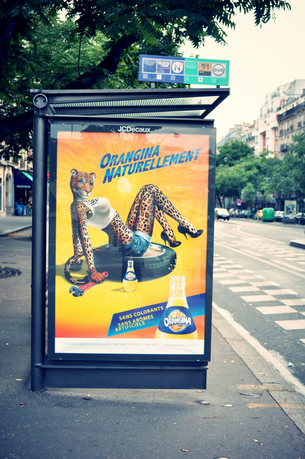
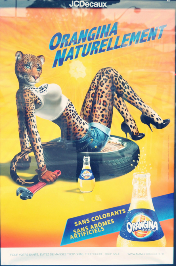

I wish I could have been a fly on the wall during the meetings that eventually lead to this campaign. Because this ad campaign didn’t appear out of thin air. There were brainstorming sessions by ad creatives, meetings with the brand’s executives, many many sessions in which they fine-tuned the drawings… So, I am amazed that something so controversial was greenlighted.
Here’s a rundown of disturbing points:
- Turning human beings into hyper-sexual caricatures is upsetting. But going out of one’s way to anthropomorphize and hyper-sexualize an animal is in a league of its own of pure deviance… It feels wrong on so many levels.
- In the two ads, the animals are car mechanics (who knows why). But there is a distinct difference in between the female/leopard and the male/puma – something that reinforces negative gender stereotypes.
- The female/leopard is reclining seductively. Her two main features that stand out are her black high heel shoes and her large bosom, covered by a skintight white tank top. The leopards’ main goal is clearly seduction. She’s there to be looked at.
- The male/puma is in a different position altogether: he’s crouching down on his knees. He appears to be in a position of power and control. He’s simply taking a break and drinking a soda. The two most prominent elements in this drawing are his chest muscles and his tools. Positioned strategically over his crotch. Again, we think: “power” and “control” when we see him.
- I find the ads particularly disturbing because Orangina is targeting people of all ages, but especially youngsters in these summer months. And we know how children are naturally drawn to pictures of animals. I’m most upset by the effect these ads have on little boys and girls: the ads are essentially reinforcing the notion that women must be hyper-seductive and passive, while men must be strong and powerful.
The objectification and sexualization of animals by Orangina doesn’t end with street ads. There are Orangina stickers in the windows of most Parisian bars and cafes. Here’s another photo that I snapped last night, in front of a closed café:
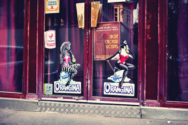
These advertising geniuses managed to sexualize even a penguin! I rest my case.
Advertising grade for Orangina: F (awful badvertising)
Evian : An Example of Diversity
While Orangina hit the badvertising trifecta, Evian managed to do an excellent job with its “Live Young” campaign. Here’s why:
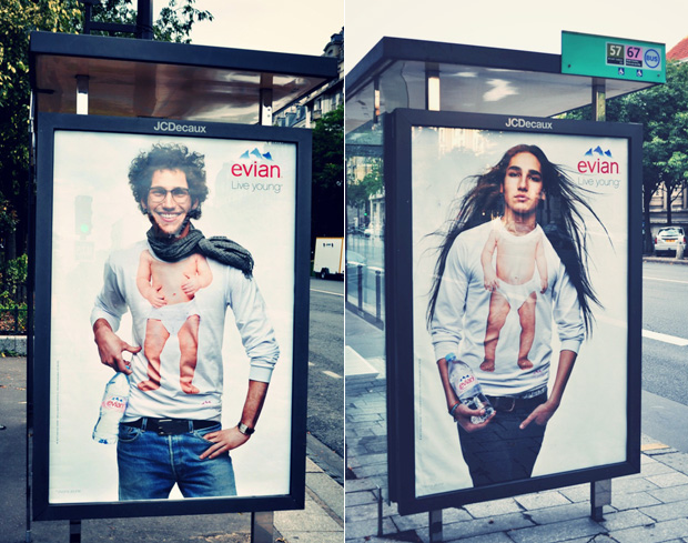

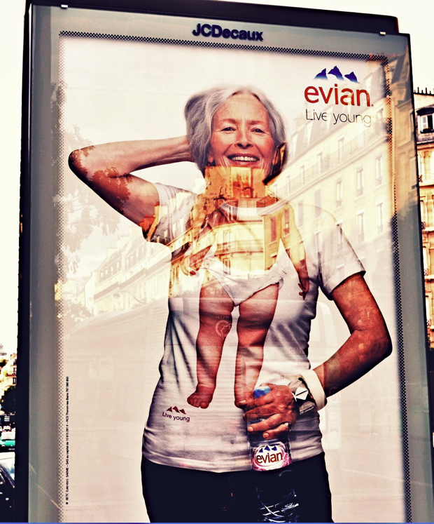
- These ads by Evian portray smiling, happy people of all ages. They are all dressed in the same way: there is no distinction in between men and women and no reinforcement of gender stereotypes.
- I love the fact that they included a young black man. Because racial and ethnic minorities are regrettably hugely under-represented in the French mass media. It’s great to see a first step towards inclusion.
- I love even more the fact that they showed an older woman (over 60) with a naturally wrinkled face – and the photo wasn’t retouched. It’s hard to see from my pic, because unfortunately I didn’t have a polarizing filter (and you can see the glass’ reflection) but I can guarantee you that they didn’t airbrush wrinkles out of this photo.
Advertising grade for Evian: A- (excellent advertising campaign that promotes diversity. Now, if they had had more body sizes, I would have given it an A. But still, kudos to Evian.)
Excellent job! Thank you 🙂
I’ve loathed the orangina ads from the moment I first saw them and was instantly appalled that no one else seemed outraged! I cringe every time I see the seductive leopard – for a country that boasts the first female sexual liberation movement, they’re much too anchored in old fashioned stereotypes and gender roles. But this is to be expected, I suppose, the French hate change!
The Orangina adverts are on their glasses as well – a good way to turn you off your drink before you start! Thank you for a good summary of exactly why they’re so unpleasant.
The Orangina ads are not only off-the-charts disturbing, they make no sense. Like, absolutely no sense. But then, so much of advertising makes no sense to me.
Just want to take this opportunity to say that I think you’re doing wonderful and important work. I *found* you via the following chain of blog surfing over the last few weeks: littlebrownpen > c’est christine > lost in cheeseland > you! So not quite six degrees of separation, but something along those lines 🙂
Huge and instant fan of your work.
Thank you so much for the kind words, Marisa. I really appreciate! 🙂
Yeah, saw them in Paris over summer. And while I do agree on Orangina, I somehow felt that Evian ads are, although clever, simply perpetuating the imperative of youth and fear of aging. There are more benefits to your health then looks, but okay.
Also, I just can’t agree with the idea of buying bottled water in a place where tap water is drinkable and tasty.
Other then that, nice campaign. Unfortunately, I find it pointless, but that’s more because of my personal beliefs stated above.